Widget Composition#
We can think of a widget in terms of a collection of components, which in
turn are made up of elements. Each of the widgets has one or more components
and elements that can be referenced directly using the Style class. Remember
- every ttk widget has a style property option where we put a
cross-reference to the Style() command which can modify a widget's appearance
(colour, size, relief and font).
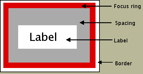
Take a look at the button widget it is a rectangular shape divided into 4 elements, starting from the outside - border, focus, spacing and label.
Button Elements#
Elements of a Button#
Button is a single part (Button) made up of several elements.
While we are thinking of elements look at the vertical scrollbar.
Scrollbar Elements#

Elements of a Scrollbar#
The vertical scrollbar has up and down arrows as well as a thumb element all contained in a trough (yet another element). Within the Style class there are methods to find out the element names, their relative positions and their options, so do not fret or worry about trying to remember everything in detail.
Note
The Widget and its Elements
In the official documentation the widget only comprises of
elements, so a button layout is called up by TButton. The
element names are preceded by Button such as Button.border,
Button.focus, Button.padding or Button.label.
In contrast the scrollbar layout is called up either by
Vertical.TScrollbar or by Horizontal.TScrollbar.
The element names will be preceded by
Vertical.Scrollbar or Horizontal.Scrollbar such as
Vertical.Scrollbar.trough, Vertical.Scrollbar.uparrow,
Vertical.Scrollbar.downarrow or Vertical.Scrollbar.thumb.