Style.configure#
After all that we now know the class and element names for all widgets in our chosen theme. Using this information we can use Style.configure() to change the widgets.
As a first example let's change the button widget, we want to alter the text properties, foreground, background and/or font. Foreground and background are both colours which can be expressed as names or a six figure hexadecimal hash. Use 02colour_codes.py to show the colour and the alternative code style.
Haven't we got all the element names for the button already? No, then we'll have to use the right component name in our query (and it wasn't highlight). Use your interactive session, and if you were on the right track you should get the answer together with 11 other elements. Now you are no longer limited to just foreground, background and font.
When using Style.configure we require a reference to the style change using the format newStyleName.oldStyleName, where oldStyleName corresponds to our class name, in this case TButton. Normally we choose a descriptive name for the newStyleName, so for the button widget we can write
s.configure('green.TButton', foreground='green')

b = ttk.Button(self, text='Friday', style='green.TButton')
The style property of Button references the style name set up in Style.configure. The configuration name can be built on a previously named style, so if we wanted a red background we could do this using red.green.TButton say. If we need to configure another element (background) just list the extra element after the handle name.:
     s.configure('green.TButton', foreground='green')
     s.configure('red.green.TButton', background='red') # our compound style

     b = ttk.Button(self, text='Friday', style='red.green.TButton')
     # now try changing both style and configure from red.green.TButton to
# mix.TButton
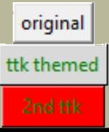
We can modify /examples/01two_buttons.py to incorporate the colour changes, we should see something like /examples/02two_coloured_buttons.py.
Show/Hide Code 02two_coloured_buttons.py
''' colouring the ttk buttons '''
from tkinter.ttk import Style, Label
from tkinter import Tk
from tkinter import Button as origb
from tkinter.ttk import Button as tileb

root=Tk()
s = Style()
s.theme_use('default')
l = Label(root,text='Run the mouse over the buttons below \n also left click \
on each one').pack(padx=5, pady=5)
s.configure('green.TButton', foreground='green')
s.configure('red.green.TButton', background='red')
origb(root,text='original tkinter').pack(padx=5, pady=5)
tileb(root,text='ttk themed',style='green.TButton').pack(padx=5, pady=5)
tileb(root,text='2nd ttk',style='red.green.TButton').pack(padx=5, pady=5)

root.mainloop()
Two Coloured Buttons#
Horizontal Scrollbar - Style#

Classic theme#
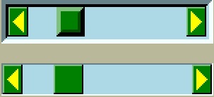
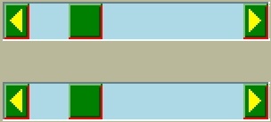
Changing the button was easy wasn't it, feel like a challenge? Let's try modifying a horizontal scrollbar, use the layout and element_options to find all likely element candidates for the classic theme. We need to use place and set (instead of pack or grid) when displaying the widget or else the scrollbar remains squashed and you can't see your results. If we make the scrollbar green with a light blue trough the result should look like 02scrollbar.py.
Show/Hide Code 02scrollbar.py
'''
Altering a widget with orientation

- look how configure needs the orientation in the style cross reference.
The widget needs to have its orientation in the property orient.

When the Scrollbar is unattached it can only be displayed properly using place
rather than pack or grid layout managers.

The classic theme displays a quirky arrow change when the borderwidth is changed.
'''
from tkinter import Tk, font
from tkinter.ttk import Style, Scrollbar

root = Tk()
style = Style()
style.theme_use('classic')
test_size = font.Font(family="Times", size=12, weight="bold").measure('Test')
mult = int(test_size / 30)

style.configure("1st.Horizontal.TScrollbar",
                background="Green", troughcolor="lightblue", bordercolor="blue",
                 arrowsize=20*mult, borderwidth=5)

style.configure("2nd.Horizontal.TScrollbar",
                background="Green", troughcolor="lightblue", bordercolor="blue",
                 arrowsize=20*mult)

hs = Scrollbar(root, orient="horizontal", style="1st.Horizontal.TScrollbar")
hs.place(x=5*mult, y=5*mult, width=150*mult)
hs.set(0.2,0.3)

hs2 = Scrollbar(root, orient="horizontal", style="2nd.Horizontal.TScrollbar")
hs2.place(x=5*mult, y=50*mult, width=150*mult)
hs2.set(0.2,0.3)

root.mainloop()
Creat a second scrollbar where the borderwidth is the default value, otherwise configure background and troughcolor the same as the first scrollbar. Check the arrows.
There was not a great deal of difference to the button example, just that we had to remember to add the orientation to the configuration name.
If you try one of the other themes alt, clam or default we have the additional options of arrowcolor and bordercolor, try out arrowcolor with yellow say and bordercolor with red. Classic has no arrowcolor or bordercolor options but if included then there is no reaction, not even a warning.
|
|
|
default |
alt |
clam |
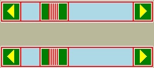
The default theme has no bordercolor, whilst alt only changes the right hand and lower border parts of arrow and thumb, whereas clam changes all the borders including the grip colour.
Show/Hide Code 02scrollbar_theme.py
'''
Altering a widget with orientation

- look how configure needs the orientation in the style cross reference.
The widget needs to have its orientation in the property orient.

When the Scrollbar is unattached it can only be displayed properly using place
rather than pack or grid layout managers.

The classic theme displays a quirky arrow change when the borderwidth is changed.
'''
from tkinter import Tk, font
from tkinter.ttk import Style, Scrollbar

root = Tk()
style = Style()
style.theme_use('default')
test_size = font.Font(family="Times", size=12, weight="bold").measure('Test')
mult = int(test_size / 30)

style.configure("1st.Horizontal.TScrollbar",
                background="Green", troughcolor="lightblue", bordercolor="red",
                 arrowcolor='yellow', arrowsize=20*mult, borderwidth=5)

style.configure("2nd.Horizontal.TScrollbar",
                background="Green", troughcolor="lightblue", bordercolor="red",
                 arrowcolor='yellow', arrowsize=20*mult)

hs = Scrollbar(root, orient="horizontal", style="1st.Horizontal.TScrollbar")
hs.place(x=5*mult, y=5*mult, width=150*mult)
hs.set(0.2,0.3)

hs2 = Scrollbar(root, orient="horizontal", style="2nd.Horizontal.TScrollbar")
hs2.place(x=5*mult, y=50*mult, width=150*mult)
hs2.set(0.2,0.3)

root.mainloop()
LabelFrame - Style#

The last type of widget are those with auxiliary parts. Taking LabelFrame as an example, we would normally wish to modify the label part rather than the Frame. We can fill the frame with a tkinter coloured frame to show off the widget. The second labelframe, by contrast, has a coloured frame. It is important to emphasise that Style.configure calls either TLabelframe or TLabelframe.Label, depending whether we wish to alter the label or the frame, but in both cases the style property only refers to TLabelframe with no suffix. This is illustrated in /examples/02labelframe.py.
Show/Hide Code 02labelframe.py
'''
LabelFrame is split,

we have to have two separate configure clauses to be able to alter
the colours of the Label (anciliary part) and the Frame (main part). The first
2 LabelFrames are displayed one with a label colour change  the other with a
frame colour change. The third LabelFrame changes both parts.
'''
from tkinter import Frame,Tk, font
from tkinter.ttk import LabelFrame,Style

root = Tk()
test_size = font.Font(family="Times", size=12, weight="bold").measure('Test')
mult = int(test_size / 30)
s = Style()
# change label colour here, we could program different colours to suit the
# application requirements
ch = 'lightgreen'
# altering label - anciliary part
s.configure(ch +'.TLabelframe.Label', background=ch)
# altering main part
s.configure('pink.TLabelframe', background='pink')
# altering both parts
s.configure('both.TLabelframe',background='#40E0D0')
# altering both parts
s.configure('both.TLabelframe.Label',background='light blue')

# LabelFrame with altered anciliary part
# do not use ch+".TLabelframe.Label"
lf = LabelFrame(root, text = "Label", style = ch+".TLabelframe")
lf.pack( anchor = "w", ipadx = 10*mult, ipady = 5*mult, padx = 10*mult,
                  pady = 0, side = "top")
Frame(lf, width=100*mult, height=100*mult, bg='yellow').pack()

# LabelFrame with altered main part
lf1 = LabelFrame(root, text = "Frame", style = "pink.TLabelframe")
lf1.pack( anchor = "w", ipadx = 10*mult, ipady = 5*mult, padx = 10*mult,
                  pady = 5*mult, side = "top")
Frame(lf1, width=100*mult, height=100*mult, bg='yellow').pack()

# LabelFrame with both parts altered
lf2 = LabelFrame(root, text = "Both", style = "both.TLabelframe")
lf2.pack( anchor = "w", ipadx = 10*mult, ipady = 5*mult, padx = 10*mult,
                  pady = 0, side = "top")
Frame(lf2, width=100*mult, height=100*mult, bg='yellow').pack()
root.mainloop()
Treeview - Style#

The next example 02treeview.py shows how to select a theme then apply some colour changes to the widget, this has two sets of colours so we can confirm which works best by first testing, then try uncommenting 'Heading' in line 110 so that Treeview style reads 'Custom.Treeview.Heading '. The first part of the script displays the widget layout in a form that is easy to read - there probably is an easier way to do this! To view the colour changes we use 2 treeview widgets, the first has not been customised.
Show/Hide Code 02treeview.py
  1'''
  2Using Treeview to compare the effects of changing the theme with a customised
  3configure.
  4
  5Since Treeview is a composite widget we require 2 configure clauses - one for
  6the heading the other for the content of the contents. The first treeview is
  7the theme standard, the second treeview is configured.
  8
  9The content of Text has been formatted to display the layout in a more pleasing
 10manner.
 11'''
 12
 13from tkinter import Tk, Text, font
 14from tkinter.ttk import Style, Combobox, Label, Treeview
 15
 16# layout refreshed when the theme is changed
 17def theme_changed(theme):
 18    style.theme_use(theme)
 19    lay = style.layout('Treeview')
 20    #lay1 = style.layout('Treeview.Heading')
 21    # this can be changed to lay1 if looking at heading layout
 22    data = " ".join(str(x) for x in lay)
 23    spos = 0
 24    apos = 0
 25    ipos = 0
 26    maxsize = 0
 27    step = 0
 28    indent = '    '
 29    # 1 opening bracket removed when converting to string, step starts from 0
 30    nrBrackets = data.count('[')
 31    while apos != -1:
 32        apos = data.find(('(' if apos==0 else '['), ipos )
 33        ipos = data.find('{',spos)
 34        spos = data.find(': [', apos )
 35        if step == 0:
 36            elo = '[' + data[apos: ipos] + '\n  ' + data[ipos: spos] + ':'
 37            adj = len('[' + data[apos: ipos])
 38        elif step < nrBrackets:
 39            elo = step*indent + data[apos - 1: ipos] + '\n' +'  ' + \
 40                step*indent  + data[ipos - 1: spos + 1]
 41        else:
 42            elo = step*indent + data[apos - 1: ipos] + '\n  ' + \
 43                step*indent + data[ipos - 1: spos] + ']'
 44        if len(elo) > maxsize:
 45            maxsize = len(elo)
 46        if apos != -1:
 47            # layout information inserted into the Text widget
 48            te.insert('end', elo + '\n')
 49        step = step + 1
 50
 51    fact = font.Font(font="TkDefaultFont").metrics('linespace')
 52    def_font = font.nametofont('TkDefaultFont')
 53    font_family = def_font.actual()['family']
 54    font_size = def_font.actual()['size'] + 3
 55    style.configure(
 56        'Custom.Treeview.Heading',
 57        background='#FFFFFF', # White
 58        bordercolor='#00FF00', # Green
 59        lightcolor='#FF0000', # Red
 60        darkcolor='#0000FF', # Blue
 61        borderwidth=4,
 62        foreground='#00FFFF', # Cyan
 63        fieldbackground='#FF00FF', # Magenta
 64        troughcolor='#FFFF00', # Yellow
 65        arrowcolor='#A52A2A', # brown
 66        focuscolor='#40E0D0', # turquoise
 67        font = (font_family,font_size,'bold')
 68    )
 69
 70    style.configure(
 71        'Custom.Treeview',
 72        background='#FFFF00', # Yellow
 73        bordercolor='#00FF00', # Green
 74        lightcolor='#FF0000', # Red
 75        darkcolor='#0000FF', # Blue
 76        borderwidth=4,
 77        foreground='#FF00FF', # Magenta
 78        fieldbackground='#00FFFF', # Cyan
 79        troughcolor='#FFFFFF', # White
 80        arrowcolor='#A52A2A', # brown
 81        focuscolor='#40E0D0', # turquoise
 82        rowheight=fact, font=font.nametofont("TkDefaultFont")
 83    )
 84    return maxsize - adj, step
 85
 86root = Tk()
 87style = Style()
 88test_size = font.Font(family="Times", size=12, weight="bold").measure('Test')
 89mult = int(test_size / 30)
 90
 91la0 =Label(root, text="Treeview layout, may change with the theme")
 92la0.pack(pady=5)
 93te = Text(root, bg='#FFFFBB')
 94te.pack(pady=5)
 95la1 =Label(root, text="Select the theme")
 96la1.pack(pady=5)
 97
 98combo = Combobox(root, values=sorted(style.theme_names()), state='readonly')
 99combo.set(style.theme_use())
100combo.bind('<<ComboboxSelected>>', lambda _e: theme_changed(combo.get()))
101combo.pack(pady=5)
102
103out = theme_changed(style.theme_use())
104te['width'] = out[0]
105te['height'] = out[1]
106dataCols = ('Name', 'hash')
107treeData = (('alice blue', '#F0F8FF'),
108                        ('azure', '#F0FFFF'), ('brown4', '#8B2323'))
109w = Treeview(root, columns=dataCols, show='headings')
110for col in dataCols:
111    w.heading(col, text=col.title())
112    w.column(col, width=75*mult)
113for ix, item in enumerate(treeData):
114    w.insert('', 'end', values=item)
115w.pack(padx=5, pady=5)
116la2 = Label(root,text='Notice how the lower Treeview changes with theme')
117la2.pack(padx=5, pady=5)
118w2 = Treeview(root, columns=dataCols, show='headings',
119                    style='Custom.Treeview') # .Heading')
120for col in dataCols:
121    w2.heading(col, text=col.title())
122    w2.column(col, width=75*mult)
123for ix, item in enumerate(treeData):
124    w2.insert('', 'end', values=item)
125w2.pack(padx=5, pady=5)
126
127root.mainloop()
To show the layout I used a function, this was then compared to Pretty Print:
>>> import pprint
>>> import ttk
>>> s = ttk.Style()
>>> s.theme_use('default')
>>> lay = s.layout('Treeview')

>>> pprint.pprint(lay)
[('Treeview.field',
{'border': '1',
'children': [('Treeview.padding',
              {'children': [('Treeview.treearea', {'sticky': 'nswe'})],
               'sticky': 'nswe'})],
'sticky': 'nswe'})]
- Well:
That was much easier!
Entry - Style#
Entry style - using the clam theme#
Generally try to keep it simple, try looking for an element that looks as though it should work, test it and see. Look at 02Entry.py.
Show/Hide Code 02entry.py
'''
Entry may cause problems with the OS

We wish to create a light blue background, working with Linux all we need is to
use Style then configure fieldbackground - however if we run under Windows or
Mac we have to use a standard ttk theme, such as clam, then the widget can be
easily changed using configure.

The additional steps are shown in the commented lines to change the widget if
using Windows and a standard ttk theme is not used.

Most ttk widgets set the font when using configure, Entry is an exception in
that we set the font as a property.
'''
from tkinter import Tk, font
from tkinter.ttk import Style, Entry, Label

root_window = Tk()
root_window.geometry("100x100+600+500")
estyle = Style()
estyle.theme_use('clam') # if not used then uncomment element_create and layout
# estyle.element_create("plain.field", "from", "clam") # "plain.field" is the
# cross reference follows the layout of "vista", need layout to enable
# configure with vista
#test_size = font.Font(family="Times", size=12, weight="bold").measure('Test')
#mult = int(test_size / 30)
fact = font.Font(font="Gigi 12").metrics('linespace')
#print(fact)
'''
estyle.layout("EntryStyle.TEntry",
# using the cross reference
                   [('Entry.plain.field', {'children': [(
                       'Entry.background', {'children': [(
                           'Entry.padding', {'children': [(
                               'Entry.textarea', {'sticky': 'nswe'})],
                      'sticky': 'nswe'})], 'sticky': 'nswe'})],
                      'border':'2', 'sticky': 'nswe'})])
'''
estyle.configure("EntryStyle.TEntry", # handle for style in Entry
    fieldbackground="light blue", # Set colour here "EntryStyle.TEntry"
    height=fact)   # font must be set in entry properties - not here
lab = Label(root_window, text = 'Enter a comment in the entry below')
lab.pack(padx=10, pady=10)
entry = Entry(root_window, style="EntryStyle.TEntry", font="Gigi 12")
entry.pack(padx=10, pady=10)

root_window.mainloop()
If we use the clam theme it should create a blue background, however if the clam theme is not used and you are running with windows or mac OS, then the Entry widget has to change by adding an element_create and adding the newly created element to layout. To find the correct element option, either check out Changing Widget Colors or use queries on the layout and element_options, then we see that Entry.field has ('bordercolor', 'lightcolor', 'darkcolor', 'fieldbackground') whereas Entry.textarea has ('font', 'width'). If you had used the element name background, as we did for Button, the Entry widget would not have reacted.
We are now in a position to change the element colour and size of any widget, but whenever the state changes, such as pressing the widget, it will revert to a style inherited from the parent theme, so the interaction of states and style will be our next topic.
Summary of Options#
Below are 2 tables to show what is generally available to change, the first lists by widget and the options available, the second takes the option and shows what is being changed. These are based on Tk/Tcl8.6.11 Documentation select the ttk::widgetname then select STYLING OPTIONS.
Show/Hide Table 02style_options.csv
Widget |
Options |
|---|---|
TButton |
anchor, background, bordercolor, compound, darkcolor, foreground, font, highlightcolor, highlightthickness, lightcolor, padding, relief, shiftrelief, width |
TCheckbutton |
background, compound, foreground, indicatorbackground, indicatorcolor, indicatormargin, indicatorrelief, padding |
TCombobox |
arrowcolor, arrowsize, background, bordercolor, darkcolor, focusfill, foreground, fieldbackground, insertcolor, insertwidth, lightcolor, padding, postoffset, selectbackground |
TEntry |
bordercolor, darkcolor, fieldbackground, foreground, insertcolor, insertwidth, lightcolor, padding, relief, selectbackground, selectborderwidth, selectforeground |
TFrame |
background, relief |
TLabel |
background, compound, foreground, font |
TLabelframe |
background, bordercolor, borderwidth, darkcolor, labelmargins, labeloutside, lightcolor, relief |
TLabelframe.Label |
background, font, foreground |
TMenubutton |
arrowsize, background, compound, foreground, font, padding, relief, width |
TNotebook |
background, bordercolor, darkcolor, foreground, lightcolor, padding, tabmargins, tabposition |
TNotebookTab |
background, bordercolor, compound, expand, font, foreground, padding |
TPanedWindow |
background |
Sash |
background, bordercolor, gripcount, handlepad, handlesize, lightcolor, sashpad, sashrelief, sashthickness |
TProgressbar |
background, bordercolor, darkcolor, lightcolor, maxphase, period |
TRadiobutton |
background, compound, foreground, indicatorbackground, indicatorcolor, indicatormargin, indicatorrelief, padding |
TScale |
background, borderwidth, darkcolor, groovewidth, lightcolor, sliderwidth, troughcolor, troughrelief |
TScrollbar |
arrowcolor, arrowsize, background, bordercolor, darkcolor, foreground, gripcount, lightcolor, troughcolor |
TSeparator |
background |
TSizegrip |
background |
TSpinbox |
arrowcolor, arrowsize, background, bordercolor, darkcolor, fieldbackground, foreground, insertcolor, insertwidth, lightcolor, padding, selectbackground, selectforeground |
Treeview |
background, fieldbackground, font, foreground, rowheight |
Heading |
background, font, relief |
Item |
foreground, indicatormargins, indicatorsize, padding |
Cell |
padding |
Note
Not all the options are available to every theme, in general use one of the standard themes alt, clam, classic or default for the most options.
Tip
Font Change
See which style options include font, Entry and its siblings Combobox and Spinbox changes the font directly from the widget property, not by style.
Show/Hide Table 02style_option_change.csv
Option |
Change |
|---|---|
arrowcolor |
color |
arrowsize |
amount |
background |
color |
bordercolor |
color |
borderwidth |
amount |
compound |
compound |
darkcolor |
color |
expand |
padding |
fieldbackground |
color |
focusfill |
color |
foreground |
color |
font |
font |
gripcount |
amount |
groovewidth |
amount |
handlepad |
amount |
handlesize |
amount |
indicatorbackground |
color |
indicatormargin |
padding |
indicatorrelief |
relief |
indicatorsize |
amount |
insertcolor |
color |
insertwidth |
amount |
labelmargins |
amount |
lightcolor |
color |
maxphase |
amount |
padding |
padding |
period |
amount |
postoffset |
padding |
rowheight |
amount |
sashpad |
amount |
sashrelief |
relief |
sashthickness |
amount |
selectbackground |
color |
selectforeground |
color |
sliderwidth |
amount |
tabmargin |
padding |
tabposition |
side |
troughcolor |
color |
troughrelief |
relief |
width |
amount |