

Common and Colours#
10third_theme_note.py#
We can now see whether the colours and common settings are correct. The colours only seem to react correctly if a hash value is used, RGB seemed to create only black.
We can also clean up the code a bit and ensure that the image aliases correspond to the file names.
Lime_Theme#
When satisfied start building lime_theme.py, put lime theme in the examples
directory, just ensure that there is the references to lime in the
style.theme_create clause. Ensure that the files are referenced with the
correct image type png.
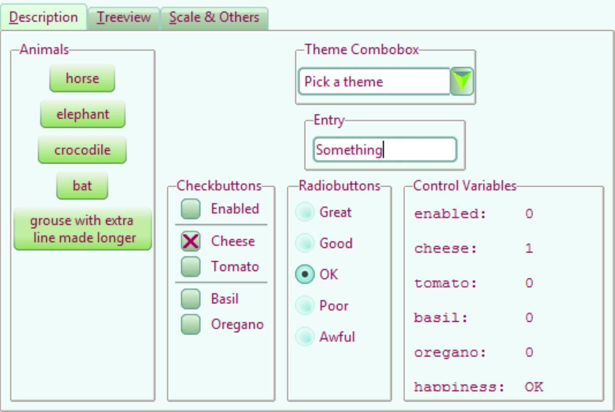
Adapt 07piratz-notebook.py to 10third_theme_note.py where we can see the
widgets in a mini application. The application will point to the image
directory ../images/lime.
Show/Hide Code 10lime_various.py
from tkinter import Tk, PhotoImage, StringVar
from tkinter.ttk import Style, Label, Radiobutton, Frame, Entry, Combobox
from tkinter.font import Font

root = Tk()

colours = {
    "frame": '#EFFCF9',#'#2D4C46', "#efefef",
    "disabledfg": "#aaaaaa",
    "selectbg": "#5D9B90",
    "selectfg": "#ffffff"
    }

def change_state():
    oldstate = widg.state()
    if len(oldstate) > 0:
        # convert tuple to string
        oldst = " ".join(str(x) for x in oldstate)
        widg.state(['!'+oldst])
        #widg1.state(['!'+oldst])
    newstate = state_val.get()
    widg.state([newstate])
    #widg1.state([newstate])

style = Style()

fr = Frame(root)
fr.grid(column=0,row=0,sticky='nsew')

states = ['active', 'alternate', 'background', 'disabled',
                      'focus', 'invalid', 'pressed', 'readonly', 'selected']
# Create rasio buttons which will display widget states

state_val = StringVar()
for iy, state in enumerate(states):
    st_rb = Radiobutton(fr, value=state, text=state,
            variable=state_val, command=change_state)
    st_rb.grid(column=0,row=iy,padx=5,pady=5, sticky='nw')

style.theme_create( "yummy", parent="clam", settings={
#style.theme_settings('default', {
# start of theme extract
    # next line refers to common to all widgets
        ".": {
            "configure":
                {"background": colours['frame'],
                 "troughcolor": colours['frame'],
                 "selectbackground": colours['selectbg'],
                 "selectforeground": colours['selectfg'],
                 "fieldbackground": colours['frame'],
                 "font": "TkDefaultFont",
                 "borderwidth": 1},
            "map": {"foreground": [("disabled", colours['disabledfg'])]}
        },
        'TEntry': {
            'configure': {'selectborderwidth': 1,
                          'padding': 2, 'insertwidth': 2,
                          'font': 'TkTextFont'}
            },
        'TCombobox': {
            'configure': {'selectborderwidth': 1,
                          'padding': 2, 'insertwidth': 2,
                          'font': 'TkTextFont'}
            }
            # end of theme extract - don't forget to add comma at end when inserting
     })
style.theme_use('yummy') # 'default'

widg = Entry(fr)
widg.grid(row=0,column=1)
widg1 = Combobox(fr)
widg1.grid(row=1,column=1)
In Conclusion#
There you have it, you now have the tools to make your own theme, which includes the most common elements and their construction.
Lastly a big vote of thanks to all those developers and programmers without whom this would not have been possible.