Style.map()#
Every widget exists with a state that for some widgets can be directly changed by the user's actions, such as moving the mouse over the widget, or by selecting or pressing the widget. Whenever the state changes the widget changes in colour, relief and/or size thus providing the user feedback. Other states which are not being changed dynamically are changed by the program. States are a fundamental part of styles and themes.
See also
Buttons changing with state, remember 01two_buttons at the end of the Basics chapter.
03states.csv#
Show/Hide Table 03states.csv
State |
Description |
|---|---|
active |
The mouse is currently within the widget and pressing a mouse button will cause some action to occur. |
alternate |
This state is reserved for application use. |
background |
Under Windows or MacOS, the widget is located in a window that is not the foreground window. |
disabled |
The widget will not respond to user actions. |
focus |
The widget currently has keyboard focus. |
invalid |
The contents of the widget are not currently valid. |
pressed |
The widget is currently being pressed (e.g., a button that is being clicked). |
readonly |
The widget will not allow any user actions to change its current value. |
selected |
The widget is selected. Examples are checkbuttons and radiobuttons that are in the 'on' state. |
All states also have an opposite condition in which the
name is prefixed by an exclamation mark, so the opposite of disabled is
!disabled and not one of the other states, such as active.
Some widgets, such as Frame would hardly ever need a state other than the normal state, others such as Button are only really useful if they use several different states. When programming with states be aware that a widget with no named state is in the "normal" state even though normal cannot be directly referenced, it is implicitly the state we have previously used when making simple changes to the widget with Style.configure. When we survey states some are never used, or as the captain of the Pinafore might say - hardly ever used.
normal |
|
active |
|
disabled |
|
focus |
|
pressed |
|


We can determine what states are currently being used in a theme. Just as in the simple style change we need to know the class name and the element we are interested in.

Relief Styles#
So if we wished to find the situation for the relief element on a button we use Style.map() in the following manner:
from tkinter.ttk import Style, Button
>>>St = Style()
>>>St.theme_use('default')
>>>St.map('TButton', 'relief')
[('!disabled', 'pressed', 'sunken')]
In this case the theme uses a compound state, in that the pressed state only applies when the button is not disabled, and the relief element becomes 'sunken'. These mapped states vary with both widget and theme. Within a theme we can have a common mapping:
>>>St.theme_use('default')
>>>St.map('TButton', 'background')
[]
Weird it's showing nothing - but we know that the background, as used in text, changed in our button examples, so how to find out what is going on.
Let's see if we have a common mapping working here:
>>>St.theme_use('default')
# '.' is the shorthand for common mapping
>>>St.map('.', 'background')
# here we have two separate states being mapped
[('disabled', '#d9d9d9'), ('active', '#ececec')]
If we test for relief, which we looked at on button, with a common mapping we get an empty result:
>>>St.map('.', 'relief')
[]
Since the common and button mapping may have more than one state what happens if we query it without any elements:
>>>St.map('.')
{'background': [('disabled', '#d9d9d9'), ('active', '#ececec')],
^            ^
'foreground': [('disabled', '#a3a3a3')]}
            ^                          ^
>>>St.map('TButton')
# added element name
{'relief': [('!disabled', 'pressed', 'sunken')]}
^        ^                                     ^
Note
The element name has been added with the extra curly brackets and full colon. When we have 2 or more elements the parts are enclosed in curly brackets.
Some of the behaviours and properties of ttk widgets are now a little more understandable when we use the common mapping system. If we are working with a widget such as label with no dynamic states, it makes no sense to send warning messages if a widget does not have that particular element or state. The other minor problem is that only widgets with the exact element name will react in a similar manner, so button has 'background', whereas entry has 'fieldbackground' and must be programmed separately.
One way to change the properties of a widget is to expand upon our simple method, so the normal state is set by configure(), we can then set the other states using map(). This means that any single element could have several properties corresponding to more than one states. Related states should be listed with tuples. We can see this in the example above for common, we have an element called background with a list of two tuples, the first tuple is for the disabled state ('disabled', '#d9d9d9') and the second tuple ('active', '#ececec') applies to the active state.
Script Map Button#
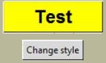
In the example 03map_button.py
     # cross reference 'Col.TButton'
    style.configure('Col.TButton', background=color,
                   foreground=['white' if color != 'yellow' else 'black'],
                    highlightthickness='20',
                    font=('Helvetica', 18, 'bold'))
     # cross reference 'Col.TButton'
    style.map('Col.TButton', foreground=[("pressed", "red"), ("active", "blue")],
                            background=[('active', active_color(color))])
we have configure which sets up the general widget appearance then uses map to set the active state by changing the background colour. Both configure and map utilise the same reference found in Button's style property option.
We randomly select from 6 colours, to set the active colour we first find the RGB colour using winfo_rgb(color) - color is the variable - then we change each of the RGB components and finally convert back to the hash value. Simple colour manipulations are straightforward in the RGB scheme. A further frill is that we use a white foreground for a dark background and a black foreground for a yellow background.
Show/Hide Code 03map_button.py
'''
Creating a colour change whenever state is changed,

using style.configure and style.map
'''
from tkinter import Tk
from tkinter.ttk import Style,Button,Label
import random


def change_style():
    color = random.choice(['red', 'blue', 'yellow', 'dark gray', 'purple', \
                           'cyan', 'brown', 'orange'])
     # cross reference 'Col.TButton'
    style.configure('Col.TButton', background=color,
                   foreground=['white' if color != 'yellow' else 'black'],
                    highlightthickness='20',
                    font=('Helvetica', 18, 'bold'))
     # cross reference 'Col.TButton'
    style.map('Col.TButton', foreground=[("pressed", "red"), ("active", "blue")],
                            background=[('active', active_color(color))])


def active_color(color):
    # active_color returns a lighter version of color for the active background
    # using winfo_rgb to get the RGB code for the color.
    c = root.winfo_rgb(color)
    r = c[0] / 65535 * 255
    g = c[1] / 65535 * 255
    b = c[2] / 65535 * 255
    r += (255 - r) / 2
    g += (255 - g) / 2
    b += (255 - b) / 2
    return ("#%2.2x%2.2x%2.2x" % (round(r), round(g), round(b))).upper()


root = Tk()

style = Style(root)
style.theme_use('default')

Label(text="Dont't forget click and hover").pack(padx=4, pady=10)
# cross reference 'Col.TButton'
button = Button(root, text='Test', style='Col.TButton')
change_style()
button.pack(padx=4, pady=10)

Button(root, command=change_style, text='Change style').pack(padx=4, pady=10)

root.mainloop()
Script Combobox in a Theme#
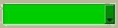
When using Style.configure and Style.map you would normally run as separate clauses within the program, however if we use theme_settings the commands configure and map can be run together into a single clause.
Show/Hide Code 03combobox.py
'''
Changing the colour of a widget using theme_settings,

configure and map are used to set up the widget
'''
from tkinter.ttk import Style, Combobox, Label
from tkinter import Tk
root = Tk()
style = Style()
# this is needed even though we are using 'default' in theme_settings
style.theme_use('default')
style.theme_settings("default", {
   "TCombobox": {          # widget class name
       # note how style.configure and style.map are formatted
       "configure": {"padding": 5},
       "map": {
        # background refers to downarrow
           "background": [("active", "sky blue"),
                          ("!disabled", "cyan")],
                # on first selecting from list the text background is grey,
                # inherited from default theme
                # fieldbackground refers to field
               "fieldbackground": [("!disabled", "green3")],
               "foreground": [("focus", "OliveDrab1"),
                          ("!disabled", "OliveDrab2")],
               "font": ('Gigi 12')
           }
   }
})
l= Label(text='Use the right down arrow to see choice then select')
l.pack(padx=5, pady=5)
combo = Combobox(values=['apple', 'banana', 'orange']).pack(padx=5, pady=5)
root.mainloop()
Note
See how configure and map are used in theme_settings - with quotes and followed by a full colon.
Since we are running the program as a theme, combobox will react to our settings without the need for Combobox to have a property style setting.
Punctuation in Map#
Now is a good time as ever to review the punctuation, in particular all the brackets being used. Theme_settings is a function so it has opening and closing round brackets, all those curly brackets look suspiciously like nested dictionaries, especially when we note the full colons following "Combobox", "configure" and "map" (our erstwhile functions), "background", "fieldbackground" and "foreground" are the relevant elements. The states and their relevant values (in these cases colours) are contained as pairs in tuples - round brackets. When we have two or more states used on a single element then we have a list of tuples - square brackets. But you probably already knew that.
See also
Just look at 03map_button.py again and compare how the programming differs when using style.configure or style.map as standalone functions.
When using a standalone theme, coming up soon, the method of theme_settings is the same as that used in theme_create. Theme_settings changes the style of the parent theme for a widget or two, all the other widgets still appear as normal - so theme_use still refers to the parent theme, whilst theme_create supplants the parent theme and we would instead refer to the newly created theme name in theme_use.
Keeping to the style system we can easily have two or more widgets with differing properties - this is useful when comparing appearances and state changes during the testing phase and help in choosing the most appropriate settings.
Mapping is primarily concerned with dynamic widgets and their states, but we know that there are states that need to be selected from the program, in this case use the following construct for ttk, (see 03states_themes.py, coming soon):
checkbox.state(['selected'])  # ticks the checkbox
checkbox.state(['!selected']) # clear the checkbox
whereas in tkinter we would use the following construct:
listbox['state']='normal'
listbox['state']='disabled'
Warning
The order of mapping states for the element is important. If the active tuple is placed before the pressed tuple then when the button or scrollbar is pressed the colour remains as the active colour without changing for other states. As ever - test first.
It is useful to be able to see the individual widgets when changing their states. 03states_themes.py gives you the abilty to do just that see the following page.